Every flat map projection distorts something, so every projection has to optimize some parameter and trade off other utility. I'm constantly amazed at how hung up people are on apparent size of countries. If size is your thing, use some other projection!
Mercator is and remains popular because it preserves local angles and shapes, which makes it simple use this projection to navigate by rhumb lines (compass headings). Because most maps people are exposed to are designed for navigation, it is the most commonly seen projection. And yes, it distorts size and is largely unusable past about ± 70º latitude. Every map is a compromise.
> Every flat map projection distorts something, so every projection has to optimize some parameter and trade off other utility. I'm constantly amazed at how hung up people are on apparent size of countries. If size is your thing, use some other projection!
That's the point of the post. The trade-offs between different projections are rarely discussed, considered or even mentioned outside very small cohorts because there is a specific shape of the world map that most people who are not map-heads or spherical projection experts take for guaranteed. Get a non-Mercator projection map and put it in your dinner room, and then see how many of your guests will comment about "so.. why is this map weird? It doesn't look right?" then tell them "every flat map projection distorts [...]"
> Mercator is and remains popular because it preserves local angles and shapes, which makes it simple use this projection to navigate by rhumb lines (compass headings). Because most maps people are exposed to are designed for navigation, it is the most commonly seen projection. And yes, it distorts size and is largely unusable past about ± 70º latitude. Every map is a compromise.
Out of the millions of decorative world maps on walls, kids with maps to learn the world, world maps on the news, maps used in data visualization charts etc., non of those are using the map for "navigation" yet they still use Mercator projection simply because "that's the right shape of the world" regardless of what "right" means. Not because they evaluated the compromises of the different projections and figures "oh maybe someone will be lost at sea and only have access to our GDP per capita world map visualization, better use Mercator projection to preserve local angles and line up with compass headings"
I lost it in the post. Whenever I hear the “crisis” part presented without the perfectly rational explanation I get frustrated and spend more time trying to figure out if this is a problem.
Saying “maps distort the way we see the world” is a problem unless you immediately follow it with “and that’s ok because…”
Otherwise we waste time on stuff like “eyeballs distort the way we see the world” when it’s true but not an issue at all.
Especially since the first paragraph mentions how countries closer to the equator tend to be poorer. As if that’s somehow relevant.
I don't understand what you're saying. The article doesn't present this as a crisis. It doesn't really make sense to say it's okay or not okay, except insofar as anything that isn't an existential threat is okay, I suppose.
The second sentence of the article strongly implies some nefarious concentration of power and wealth among the globally powerful countries is at the root of the popularity of mercator projections.
Well, they is a "nefarious concentration of power and wealth among the globally powerful countries". And the Mercator projection does suit them practically, and shows their countries bigger than they are, so...
> And the Mercator projection does suit them practically, and shows their countries bigger than they are, so...
So what?
Do these countries become more powerful, richer, or have more resources than others because they are represented bigger on a common map projection? If so, then let's just hope that our new overlords from the Antarctican Coalition are benign emperors :D
>Do these countries become more powerful, richer, or have more resources than others because they are represented bigger on a common map projection?
No. They become so by colonizing and stealing other's resources. Then the map projections that are convenient for them, are imposed upon the rest of humanity.
This, among other legitimate uses, has the side-benefit for them of presenting said countries as larger than they are, and thus being one more way to subconsciously hammer onto everybody their superiority at that level too...
> They become so by colonizing and stealing other's resources.
Pretty sure all of the former colonies are independent nations by now, and have been for more than a generation.
> Then the map projections that are convenient for them, are imposed upon the rest of humanity.
Excuse me? Who is imposing what on whom now, and how?
Last time I checked, everyone is free to use whatever map projection they want, centered on whatever point of the globe they want. Or they can use an actual globe.
> has the side-benefit for them of presenting said countries as larger than they are, and thus being one more way to subconsciously hammer onto everybody their superiority at that level too...
Yeah, pretty sure I don't perceive Antarctica as some kind of superior super-nation. Or greenland, although I gotta say, it's a really cool place, especially during summer.
>Pretty sure all of the former colonies are independent nations by now, and have been for more than a generation.
Yes. And if someone breaks your legs, you should totally be able to run a marathon after, say, 15 years. After all, they haven't broke your legs for a while.
History and national development doesn't work like that. A major handicap can still keep you back for centuries.
It's even more than a handicap relatively too. It's not just that you were held down (and the other side neutral): the handicap for you was at the same time an enrichment off your back for the other side.
Even more more so, since "independent nations" is mostly a facade for the busines as usual, of neocolonialism: the same shit, but somewhat more convert (bribing politicians, setting up banana-republic conditions, if needed bringing in the army, supporting this or that dictator into power, and so on, and using monetary policy and foreign aid to make sure they never stand on their legs).
Yeah, I'm not gonna discuss colonialism here. Multiple generations are a long time to get things in order. Many countries rebuilt from scratch into powerful industrialized nations within decades after major wars.
And it's also not the topic of the discussion tbh. This is about the impact of the Mercator projection, and unless I get to see a peer reviewed study convincing me otherwise, my point stands.
That is entirely on you tho. Becasuse that sentence does not imply anything about concentration of power nor about globally powerful countries and even nothing about origin of popularity of mercator projections.
It does imply that poor countries around equator are bigger then they look like. That is it.
I read it as the post is simply pointing out something that a large percentage of the population was not even aware about. I don't think it goes any deeper than that.
Why is it important that poor people live near the equator? I expect that a large part of the population is aware of this fact.
So bringing it up doesn’t contribute to the article and is a bit off in the article. Why not mention that the days are longer in the summer away from the equator. Or they people near the equator have darker pigment. Or many other true but irrelevant facts.
Because the equator in the Mercator projection is the closest to "true size"...which means that the wealthier nations, well above that, are in fact exacerbated in apparent land mass.
I like this site[1] for showing the true size of countries on a standard projection. Look at how much the US actually changes in size when you move it's latitude even a little.
Like it or not, the perception of scale of a problem is linked to apparent size - Africa looks smaller then it is, whereas the European countries look a lot larger then they are. When we talk about a problem affecting somewhere, the idea that "most of the world is experiencing it" is contraindicated by our maps even if only subconsciously.
No one claimed people do this. You have created a straw man-ception. Our awareness of the world is informed by distorted maps, even if it only impacts us subconsciously.
I don’t think you are getting what I’m saying. Greenland is larger than countries we spend far more time obsessing over with history lessons.
Importance in education and subsequently people’s mental models is not at all driven by size on the projection. It’s a dumb theory not backed by any real research.
The poor countries claim has a footnote and a promise to explore it in another article. It doesn't say anything further about this.
The article also doesn't answer whether the distortions are intentional, a side-effect, a trade-off, or a combination of some of this. The author promises a follow-up article, unfortunately a "premium" one which I suppose you must pay for (edit: sadly, it's paywalled: https://unchartedterritories.tomaspueyo.com/p/are-maps-decei...)
People have a problem with this post and these kind of posts because they imply it was deliberately done for evil reasons.
The point of any article isn't just its factual content; it's the hidden message from the way it's said. I don't know if you intended to say it the way you did when you started off with the comment about poverty in the first two sentences, but by doing so, you set the tone for the rest of your article. (You also didn't expand on that tidbit so it kind of leaves your audience wondering why you mentioned it.)
It's unlikely that it was deliberately done for evil reasons.
However it contributes to a misunderstanding that may in some way favor richer countries, and that could be a reason why nobody's trying very hard to focus kids' exposure on more accurate maps.
The mechanism I'm alluding to is a sense that "this place is very big, and so it's reasonable that it controls more than other places." It's not a highly-developed intellectual analysis, but more of a gut-level conception that informs casual interpretation of news and events.
Why do you presuppose that others infer & arrive at the same interpretations you do? Isn't your own form of generalization from the subjective inferences made from your own individual mind, to the thoughts of others, presumptuous?
I'm getting tired of the progressive tendency to read offence, bigotry, racism, sexism, transphobia, etc. into every little word & minutiae of nuance uttered by others. It's on the verge of induced pareidolia for outrage & victimhood.
Do you reside or hail from one of the aforementioned countries, or are you merely "signal boosting" and getting outraged on their behalf?
> Why do you presuppose that others infer & arrive at the same interpretations you do? Isn't your own form of generalization from the subjective inferences made from your own individual mind, to the thoughts of others, presumptuous?
No, you're just being stupid.
This isn't a new issue. There's an episode of The West Wing about the evils of the Mercator projection. It aired 22 years ago.
When you write an essay doing nothing more than repeating a several-decades-old cliche, people are going to assume you don't have anything to say other than the content of the cliche they heard decades ago. And they will be right.
> Out of the millions of decorative world maps on walls, kids with maps to learn the world, world maps on the news, maps used in data visualization charts etc., non of those are using the map for "navigation" yet they still use Mercator projection simply because "that's the right shape of the world" regardless of what "right" means
I question what percentage of those maps in reality are actually Mercator? I feel this is one of those strawman memes that mercator is everywhere, when in practice it feels relatively rare to actually encounter it.
The kiddy maps my kids had were using mercator projection. And I am pretty solid that it was because that is "the right shape of the world". The map was not meant for navigation, it was meant to display funny pictures about countries and maybe teach the kid countries exists if kid bothers. It was made by an artist after all, not by cartographer.
What country do you live in? If I visit there I'll look out for them because I see equal-area projs like never. Even the decorative one in my room right now clearly has Greenland look more than half the size of all of Africa.
I wonder how much location bias affects this. I also grew up with basically only seeing equal-area projections and globes -- that's just what my school district used. It was weird seeing all the online memes about Mercator when I grew up never seeing it, heh.
I've seen this type of post/thread many times, and yet I still learn something new every time.
For example, I'd never noticed until today that so much of Scotland is actually west of England because Great Britain doesn't actually go straight-up north to south but is rather "tilted".
I also didn't know that Papua was so big, before today I wondered how could there be so much linguistic diversity in what I though was a medium sized island.
So I don't mind the geography trivia from time to time.
> For example, I'd never noticed until today that so much of Scotland is actually west of England because Great Britain doesn't actually go straight-up north to south but is rather "tilted".
Even as a Brit this sometimes catches me out. I live near Bournemouth which is approx in the middle of the south coast of England. If I draw a straight line due North, it's only just inside Scotland. ALL of Scotland is west of London.
Unrelatedly, the other amusing fact is that when the ISS goes overhead (256 miles high at perigee), it is much closer to me than Glasgow (450 miles away).
I'd like to think you're being ironic here, but I suspect you're not, so no: the vast majority of the world is outside the US and has not, in fact, seen an obscure episode of a TV drama about American politics.
I just learned about the equal earth projection, which was apparently invented very recently in 2023. It’s the best looking equal area projection I’ve seen.
As an adult I was shocked to find out how the projection I grew up with altered my perception of my poverty-stricken country. I had no idea for my entire life that it was so much larger than other countries on the map I thought were larger. I doubt I am rare here at all.
And I have no idea what "The West Wing" is. And I doubt I am rare here at all also.
The West Wing is not the President's office, but rather the section that contains The Oval Office, which is President's office, along with other executive offices and rooms, such as the Press Briefing room, the Situation Room, etc.
> Get a non-Mercator projection map and put it in your dinner room, and then see how many of your guests will comment about "so.. why is this map weird? It doesn't look right?" then tell them "every flat map projection distorts [...]"
This is actually a pretty cool conversation topic during dinner. I would take the opportunity to show off. It doesn't have to be a downside. "Hey, did you know that [interesting stuff]...?".
If your guests are the kind of people who get irritated instead of awed by cool explanations about the world, I admit then you have a problem.
yeah, I think it would be an interesting discussion topic. Especially if you could show the 6th figure from that post (the one showing the 7,500km distortion). It just depends on how you put it. OPs remarks were condescending as if the only reason to bring this up is "because of size hang ups" as oppose to "bring this up to question your own basic wrong assumptions about the world"
It's far from common knowledge or a well known fact that the only reason the World Map looks the way it looks is just an arbitrary projection type that's picked for equally arbitrary reasons. Because as I mentioned, compass navigation is hardly the only map use-case. It may have originally started that way in the 1,200s or whatever, but today we use maps for all sorts of visualizations and other things. And the assumption that "Mercator projection" is the "right" shape of the world is held by most not because they have "size hang ups" but because it's just the way it is. Just like any assumption you hold that you never question because there is no reason to question it really.
2. European nations who were good at sailing created the age of empires (yes this was a bad thing)
3. These empires persisted until the end of WW2 (1945) or arguably even the Suez crisis (1956) at which point the American/Soviet world order began
Changing a map is changing everyone's internal worldview, and for obvious reason empires were not about to allow such a massive change unless they had a good reason[0] so It's really only been about 80 years and most of them we were at war with the Soviets, so when we thought about maps, we thought about if they were red or star spangled, not which projection.
I'm not saying it's right or wrong, I'm just not at all surprised we have the "original" one.
0 - I could easily see an alternate history where e.g. the Spanish and/or Portugese use a different one if it makes them look "better" than the English, or vice versa. Now i'm curious of what projection could be 'anglo/iberi-maximal'
Map projection trade-offs are discussed a lot. I studied it at school, I can't count the number of "do you realize how big country X compared to country Y" articles, (the one linked here is a good one btw) and it often pops up in trivia questions. Everyone has seen a globe, and non-Mercator maps are everywhere. Famously on National Geographics.
Also, using a (truncated) Mercator projection for a GDP per capita map (or any political map that isn't about land mass) is not a bad idea as its most notorious flaw becomes an advantage because coincidently, it tends to enlarge small countries and shrink large countries, which makes for a more readable map.
> it tends to enlarge small countries and shrink large countries, which makes for a more readable map.
It enlarges the two biggest countries in the World (Russian and Canada) while shrinking central American and central African countries that aren't particularly big to say the least…
The faux outrage is hard to take. I grew up with the chopped up non Mercator maps and nobody cared looking at one or another.
It was called out multiple times in my geography glasses in the 80s that the flat contiguous map was wrong and we spent lots of time looking at globes and North or South Pole centered maps.
Nobody is being oppressed or underrepresented by this projection. This isn’t an episode of the west wing.
The idea that we're all in the dark about the real relative sizes of the countries is silly. It's not like we look at a globe and get shocked by the sizes of the countries.
The problem with these kind of posts is that they also ignore the existence of globes. No one should be surprised by the "size" of any country because globes already exist which are a pretty close to true representation.
> The trade-offs between different projections are rarely discussed
And?
The trade-offs between longpolling and websockets are rarely discussed outside of very small cohorts. The tradeoff between wankel-engines and piston-based motors are rarely discussed. The tradeoffs between oak and pearwood are rarely discussed.
That's why our society has division of labor and people becoming experts in their topics.
And I am pretty sure experts on cartography have discussed the different merits and tradeoffs and converged on Mercator for a reason. I don't know what that reason is, and I don't care. It works, I can use it, and as long as no one can point out a tangible problem with it, I see no reason to worry about it. Same as the cartographer doesn't need to know or care why I decided that the chatapp he installed uses longpolling to communicate with the backend instead of a websocket. Same as I don't need to know or care why the carpenter who made my desk used oak instead of pear or rosewood.
And seeing countries as smaller or bigger than they are isn't a problem in my eyes. I can reasonably expect an educated person to know that maps are 3D->2D projections and are thus distorted. If I want to know the exact size, I can always look it up. I don't have a more or less favourable view of a country or its people based on the countries apparent size on a map.
The issue isn't possible bias on the part of educated cartographers and differential geometers. It's the bias of the majority, i.e. everyone else, that matters. A vast majority of people in the "Western world" perceive their countries as being bigger than they are. Thus from a primal, tribal perspective this further inflates their perception of "their peoples" being more important than the peoples of other areas.
> A vast majority of people in the "Western world" perceive their countries as being bigger than they are. Thus from a primal, tribal perspective this further inflates their perception of "their peoples" being more important than the peoples of other areas.
That’s a fun hypothesis, but is there actually data supporting (1) that “a vast majority” of westerners misperceive country size in this way, and (2) that specifically such a perception causes them to consider foreigners to be unimportant?
Although implicit bias exists, studies show its impact on the real world is much smaller than commonly believed.
> Thus from a primal, tribal perspective this further inflates their perception of "their peoples" being more important than the peoples of other areas.
And now I would like to see some data, peer reviewed study, or similarly supported source for this statement.
Because I don't see many people claiming that greenland or antarctica are super important powerhouses in the world.
Nearly no one inhabits Greenland and Antarctica, which might help explain why the only visible relative increase in Arctic/Antarctic nationalism comes from enthusiastic polar bears and mildly racist penguins.
I'm not sure there could even exist a particularly satisfying source for this. One of the issues with "soft" sciences is that it can be quite tricky to measure any effects, much less design a viable study that demonstrates causation.
I suppose a social scientist (i.e., not me) could support this claim using ideas from psychology or finding related studies. But I doubt anything will ever be particularly convincing unless we lived in a universe where people told the objective truth and a mandatory survey was asked with the explicit question, "Have the distortions induced by map projections influenced your beliefs regarding people in other countries?"
You know whose problem this is. The map buyer/owner. They can buy whatever projection fits their fancy. I happen to have Robinson projections at home because I don't prefer the cylindrical projection. I used to have homolosine projections but they were funky in other ways. Preferably people would have a Globe and also have some flat projections.
> I'm constantly amazed at how hung up people are on apparent size of countries. If size is your thing, use some other projection!
Hmm. That’s not usually how the discourse goes.
It’s never “wow, Country X is actually smaller than Country Y. That’s terrible.”
It usually goes something like “wow, Country X is actually smaller than Country Y. This distorts our worldview and makes us think things we shouldn’t have thought. That’s terrible.”
FWIW, I was amazed in school when I saw a more accurate projection of the size of Europe. I mean, I _knew_ that it was tiny. But my thoughts about Europe definitely changed after seeing the other projection.
Similarly but not size-related, I was amazed to learn that some countries place Asia in the center (and the social/cultural implications of this).
I think you should be more amazed at people who _don’t_ care at _all _ about size. Sure, this group might include reasonable people like yourself who are knowledgeable about map distortions and trade offs. But a lot of the “I don’t care” group overlaps with the “Africa is a country” group. (Map size “memes” appear on Quora often and the degenerates come out of the woodworks to complain.)
> That’s odd. Did you think land mass was somehow really important?
Yes. That and population. Generally, the larger and more populous countries tend to be the most powerful and influential.
> Did you ever check out how small Britain or Spain or Portugal or Netherlands were to the size of their empire.
Ever wonder why britain, spain, portugal and netherlands expanded their landmass by creating their empires? Ever wonder why britain, spain, portugal and netherlands lost their power and influence when they lost their empires and landmass?
> Do you now think that Indonesia is more important because of its size?
Yes along with other reasons - population, geographical location, etc.
> Generally, the larger and more populous countries tend to be the most powerful and influential.
But this is obviously not true. Just look at the list of top 10 by GDP and check out how many of them are relatively small.
I mean you have to have natural resources and can’t be tiny, but it’s not like Germany and Japan are powerful because of their landmass.
I think judging countries by their size is a mistake in rationality and people shouldn’t do that. It’s only silly people who look at Greenland on a Mercator map and think that they are powerful based on size.
It is obviously true. The five permanent security council members are US, China, Russia, UK and France. US, China and Russia are obviously gigantic. UK is gigantic via its ties to Canada, Australia, NZ. After all the silly monarch of britain is the head of state of all these nations. And France has a gigantic empire still. Go check out their EEZ.
> but it’s not like Germany and Japan are powerful because of their landmass.
Germany and Japan aren't powerful. Powerful nations aren't occupied by a foreign power. Germany and Japan are extraordinarly weak. Their economic well being is entirely dependent on the generosity of another nation.
There is a reason why Germany and Japan tried to expand their territories in ww2. They failed and they have to live with the consequences.
> I think judging countries by their size is a mistake in rationality and people shouldn’t do that.
Sure. Landmass by itself isn't everything. As I said, you have to factor in population, quality of land, ports, neighbors, etc.
> It’s only silly people who look at Greenland on a Mercator map and think that they are powerful based on size.
You quoted "the larger and more populous countries tend to be the most powerful and influential."
Do you know what populous means? It's silly to quote something and not understand it.
The countries with the 2 highest GDPs, China and the US, are in the top 4 largest countries. India, #5 in GDP, is #7 in area.
I guarantee that if you plot the countries of the world by GDP and area, you will see a trend line.
It also makes sense. More area = higher chance of larger population and more natural resources. And more space to carry out economic activities with said people and resources.
The linear plot in that Wolfram link is messed up. It doesn't show all the data (caps out at 800 billion GDP). Here's a corrected linear plot, from the script that I linked (commenting out the log-log scaling):
There is clearly a correlation, even on linear. It's a little messy, but it's undeniably there.
The starting point for this discussion was about the relationship between a country's size and population and it's power and influence. The correlation between area and GDP demonstrates that there is a meaningful relationship.
Btw, what is your specific complaint about a log-log plot? Country data points for area and GDP span many orders of magnitude, which makes it harder to visualize any patterns on a linear plot.
I also don't understand your point about the dispersion. The correlation and trend is pretty clear. No one said the correlation was 99%.
Edit: I've calculated Pearson's correlation coefficient for this data [1]. The result is 0.82, which indicates a strong positive correlation.
That's weird, are you looking only at the top 10 countries?
I've reproduced dwaltrib's results using World Bank data on 251 countries, and I get a Pearson's r of 0.82 and a p value of 5.6e-61 (!). I.e. a strong correlation, with high confidence. It makes sense too -- larger countries generally have more people, and more people generally generate more economic activity.
Code if you want to try yourself:
import pandas as pd
gdp = pd.read_csv("~/Downloads/API_NY.GDP.MKTP.CD_DS2_en_csv_v2_5551501.csv").set_index("Country Name")
You have a fixed and narrow definition of what important means.
Importance should change depending on context.
Sure, you are definitely allowed to say that a certain metric (i.e. population size or density) has more practical applications and provides better signal for “blah blah”.
I’m curious why you think my definition of important is fixed and narrow. I didn’t define it and I agree that importance is a factor of context.
I commented that it was curious that someone would think size is so important that learning the true size of countries would change their world view. In that land mass isn’t usually very important for political or cultural significance (eg, Canada is huge and that doesn’t make it important, Russia is important not because of its size, etc etc).
> I think you should be more amazed at people who _don’t_ care at _all _ about size. Sure, this group might include reasonable people like yourself who are knowledgeable about map distortions and trade offs. But a lot of the “I don’t care” group overlaps with the “Africa is a country” group.
On what are you basing it?
IME, almost nobody cares. Even folks who like maps (e.g. me) "don't care" in most cases, because flat maps will have distortions.
AFAICT, the people who really care about these distortions are folks who have political agendas and like to sling ad hominems around, such as "Folks who don't care are morons or racists."
So again:
> But a lot of the “I don’t care” group overlaps with the “Africa is a country” group.
I was basing it off of “IME” and “AFAICT” similar to what you just did in your own ad hominem attack ironically. I don’t tend to preface things like that when commenting and usually I assume this when reading comments online. I used to write “anecdotally” but it’s 2023.
On Quora, there’s a “group” sort of like a subreddit titled “It’s OK to be White”. There’s about 35k people who follow it. Their mission is to “uplift White cultures and oppose anti-White racism”.
Like I already said in my previous comment (so you didn’t need to ask twice what I was basing it off of), people often post map distortion memes on Quora and these other people from that group come out of the woodworks to complain. These memes aren’t even posted in that group. And I wish I could say that it’s just these weirdos on Quora that act like this. But no. I’ve seen it on Instagram. On Facebook. I’ve heard it in real life. It’s a thing that bothers a certain demographic of people. While it’s not a “major” thing and shouldn’t matter, it’s still a thing that I tend to see often.
I see there’s miscommunication here though. I do agree with you that most people “don’t care”. That’s the phrase we have been using. What you are saying and what I also believe is that most people are “map agnostic” for lack of a better phrase. They don’t care in that sense. Like life is too short. It’s just a map.
But when I used the phrase “don’t care” and added underscores around it and the words “at all” in my comments yesterday, I was referring to people who have _strong_ and _negative_ opinions about not caring.
For example, OP said that he was _constantly amazed_. And the other language he used evoked that he was “flabbergasted” that people care about map distortions. (Do you see how this is a different definition of “don’t care”?)
The language he was using and the emotions involved “mirrored” the language and emotions that I see on Quora and hear in real life from that specific group of people.
You’re right. I don’t have any concrete data or surveys or experiments or a sentiment analysis to show that those groups overlap. I was just basing it off of being alive for 30+ years, living in different countries, having a brain, etc.
(Also, there’s nothing wrong with calling someone a moron and/or a racist lol. The two groups usually overlap. Oops I did it again!)
> It usually goes something like “wow, Country X is actually smaller than Country Y. This distorts our worldview and makes us think things we shouldn’t have thought. That’s terrible.”
That's not less stupid than the other statement. It's like looking at your shadow at sunset and thinking, "Wow, I never realized I was 20 feet tall."
> It's like looking at your shadow at sunset and thinking, "Wow, I never realized I was 20 feet tall."
Quite the opposite, no? It's like spending your whole life looking at only your evening shadow (Hello, Plato) and then seeing yourself in a good mirror and realising your actual height relative to the world around you for the first time.
I feel like you actually stated the problem but then glossed over it.
Mercator is UX optimized for naval navigation. Besides street navigation (where projection is irrelevant) I would posit that most people use maps for human geography reasons- what countries are next to Senegal, what kind of border does Thailand have with Malaysia, etc.
In the use case of understanding geopolitical borders Mercator isn’t optimized for that.
Asking why people are dissatisfied with mercator is like asking why my grandma is dissatisfied with the command line interface on the Linux laptop I got her. Doesn’t she know it’s the best for programmers??
Why are we trading off the accuracy of political borders for navigating by rhumb lines?
I personally feel like a better projection would be one that basically ignored or distorted the oceans. On google maps there’s no reasons why the proportions of the Atlantic or Pacific would be relevant.
Well, what do you mean, the "accuracy" of political borders? Again, they're all inaccurate, just in different ways. Are you optimizing for length of border, or curvature, or orientation? Better nearer or further from the pole? Arguably there are far more borders nearer the equator than far from it, Africa has hundreds. And the Mercator projection does pretty much the best job at representing political borders length and orientation within Africa than any other.
I’m thinking about accuracy when looking at google maps.
So do you mean that the length and orientation of the borders is the least distorted with the Mercator projection?
I’m actually not sure how a different projection would distort a country’s border. But for example I’m not putting a ruler against my screen and I don’t know if I need to know if a border is oriented North or not.
Mostly my point is, are we rendering maps for real users’ use cases or backwards rationalizing the status quo? Besides the level of effort that would be involved in changing it, can’t think of any real defense of the use Mercator projection itself in its current context.
Some other comments references street maps that are grids, so a non-mercator projection would bend a grid of streets- this makes sense- but again, the main critique is around the relative size of countries- i.e. the look of the map tiles only when zoomed out sufficiently far. Maybe this is the main UX hurdle- in google maps to change the projection above some level of zoom.
Exactly! This article mostly avoids it but the usual popsci refrain of “the map you know is WRONG” is a pet peeve of mine! It’s not like one projection is any worse than another, as long as they are useful for the context it’s designed for. Maps are diagrams!
I doubt people are actively giving less value or worth to places that appear smaller on the map. Additionally, the majority of people just don’t have a concrete frame of reference of distances beyond how far we can see. As such, the only real exposure to vast distances at the scale of continents is going to be via maps, unless you have the privilege of being in LEO. It’s pretty rare that flat projection is useful for anything except trivial, surface information paired with the sort of infantilizing teaching that prompts students into pointing to their home country. If this is your only exposure to the world, it’s easy to see how you will begin to assign some value at a subconscious level. Any indirect representation of something larger is going to be a compromise based on the needs of the application, but we can do better than the flat projection just from a UX level.
> I'm constantly amazed at how hung up people are on apparent size of countries.
Something that jumps out at me with the size is that the arctic regions are often viewed as huge and massive. However, when viewed with their true size, it greatly highlights just how fragile they are.
"Because most maps people are exposed to are designed for navigation." Most maps people are exposed to aren't being used for navigation, but for education (at least where the question of the Mercator projection is concerned).
People are naturally hung up on it because why use a projection which is useful for navigation in a world history class or as a background image in a news cast or as a decoration on the wall?
"If size is your thing, use some other projection!" This is basically exactly what the people "hung up" on the Mercator projection are saying! We should be using other projections! It seems a totally reasonable thing to point out to me.
> People are naturally hung up on it because why use a projection which is useful for navigation in a world history class or as a background image in a news cast or as a decoration on the wall?
Are world history classes favoring Mercator? Are newscasts using Mercator in background images? Are wall maps using primarily Mercator? (These may have differing answers!)
As a kid I often encountered oval‐shaped world maps which obviously weren’t Mercator (most likely Robinson or Winkel tripel). And road maps of the United States had curved borders, not straight borders, so those obviously weren’t Mercator either (possibly Alders). And I had globes both at home and at school. So while Mercator is certainly common, and it’s worth explaining tradeoffs in map projection especially in an educational context, I question whether it’s actually as universal as people here are saying.
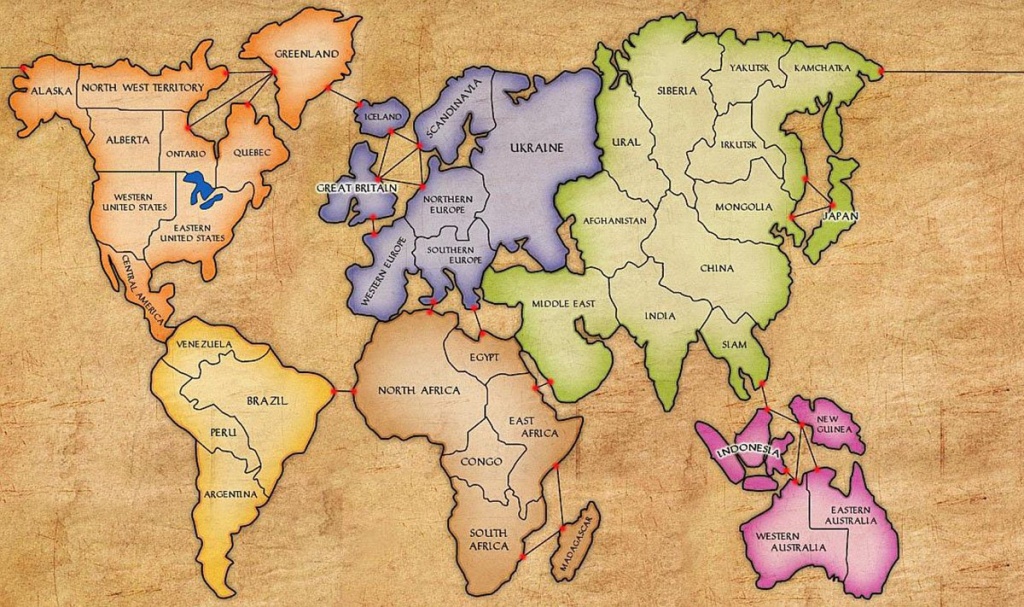
North America: 9 territories, larger than Africa.
Europe: 7 territories, as large as Africa.
USA: 3 territories, Canada: 5, Australia: 2
China, India, Brazil which are all very large: 1
I'd love maps where Europe is smaller to become the norm in schools and daily use oberall. Maybe it would make people migrating here from huge and vast countries reconsider.
>If size is your thing, use some other projection!
They're not complaining about what they can use for themselves.
They are complaining about what is in mainstream use (in schools, websites, books, documentaries, and so on) and thus what kinds of perception people get.
The worst argument. These days how many people navigate by compass headings vs how many people base personal and policy decisions due to distorted view of the planet which downsizes planet's oceans and puts the great pacific garbage patch at the far edge of the map, out of sight out of mind?
Just use another projection? Mercator is everywhere, nothing else.
And yes, size of countries is important too (eg. how people fear Russia because it seems large and discount the importance of Africa because it's next to the equator).
Every chance I get I try to promote the Cahill-Keys projection. Not only does it better preserve area and reminds you that the earth is a sphere, it is also one of the more esthetically pleasing projections out there.
The biggest miss on maps (and no fault of cartography, as there is no way to represent this well) is height and depth. The heights of mountains and the depths of water --it's hard to understand how shallow bodies of water are when compares to linear distances: the deepest part of the ocean is less distance linearly than the width of the city of SF.
Mercator just has an embedded momentum, it isn't somehow superior to other projections. Why do some people still use tech X when tech Y exists? Momentum, resistance to change, etc.
I think that obsession you are referring to is part of a far larger mental illness that is coursing through European minds and cultures; the constant, compulsive obsession with trying to find the most obscure and ridiculous reasons, causes, and excuses for how brown people are Noble Savage victims and Europeans must hate themselves.
This time the reason why Europeans must hate and destroy themselves is … spins the wheel … that maps are flat and the planet is not.
European people and culture all over that planet is very mentally sick and self-destructive. Any individual person that exhibited even slightly as mentally ill mentalities as Europeans, we would immediately seek help for them.
Mercator is and remains popular because it preserves local angles and shapes, which makes it simple use this projection to navigate by rhumb lines (compass headings). Because most maps people are exposed to are designed for navigation, it is the most commonly seen projection. And yes, it distorts size and is largely unusable past about ± 70º latitude. Every map is a compromise.